 While many traditional timepieces distinguish themselves with a number of complications, a number strive instead for as simple design as possible (not that we have featured many here on EyeOnMobility. The same cannot be said for smartwatches where the race is on to pack as many features in a bid to stand out from the competition. But what if a smartwatch company decided to instead strive for a minimal design? That’s the idea behind the fictional Watchin’ brand that Dennis van der Graaf came up with.
Less is more, we’ve all heard about it. These watches are based on this mentality. We strive for an interface with minimalistic features and a brand that stands behind it.
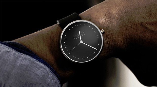
Few details are provided about the Watchin’ brand and smartwatch. The renders show us two very simply round watch designs. Both sport a case (stainless steel perhaps) completely devoid of any ornamentation save for the crown. The watch face adopts the same stark design.
The first design comes with a black case and white on black watch face design. It does away with the hour marks or numbers, opting only to keep the minute marks. “Leaving away numbers creates peace in the interface, The simplicity is important. The space inbetween [sic] the minutes suggests the number.”
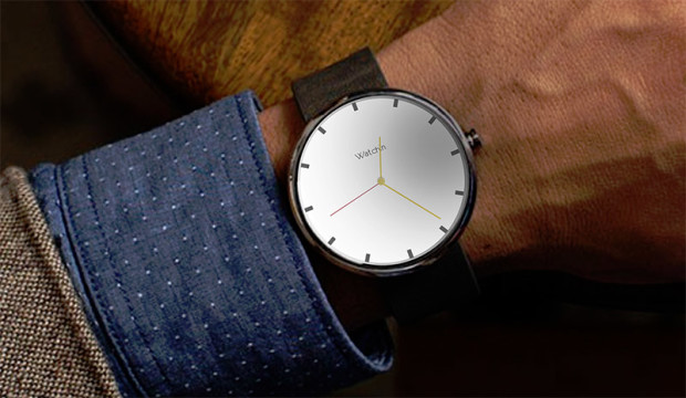
The second sports a silver case. It goes for the more traditional design with hour marks and complements it with bright yellow hours and minutes hands and a red seconds hand.
It remains to be seen if and how the Watchin’ smartwatch could extend this minimal design to other features such as notifications and activity tracking.
Source : Behance